

Timeframe
Outcome
Tools
Skills
Role
Background
We were tasked by a group of three professors from three different universities to create a beginner-friendly visualization and simulation tool for students who are new to thermodynamics. Although each of these professors were teaching thermodynamics, they were approaching the subject from a variety of different fields, including chemical engineering and mechanical engineering. We were not given much direction outside of simply creating a thermodynamics simulation, so a large part of our task was narrowing down a specific problem area to focus on.
Thermodynamics is largely abstract and mathematical, which can make learning difficult for students who benefit from visual representations.
Our primary goal was to provide students with a convenient and helpful visualization tool with which to supplement their largely theoretical and mathematics-based thermodynamics education.
The Solution


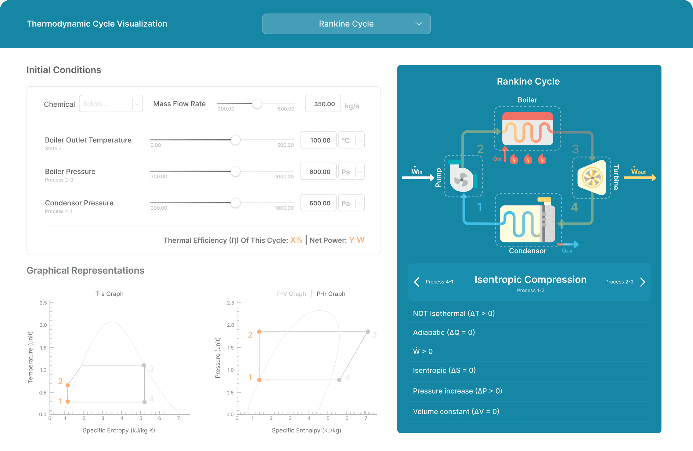
We came up with a web-based tool that accepts numerical inputs to calculate relevant equations and values, responsive graphs that reflect progressive changes through the cycle, animated visualizations that illustrate real life representations of multiple cycles, and detailed descriptions about the specifics of each stage of the cycles.
Here’s a quick overview of our ultimate solution.
The Solution


Users are able to edit a variety of available fields within the tool, including the chemical used, the heat capacity ratio, the temperatures of the hot and cold reservoirs, and the pressures of the boiler and condenser. These values can be edited by typing in inputs or moving the slider and are used to calculate the Carnot efficiency displayed in the bottom right corner of the card.
The Solution

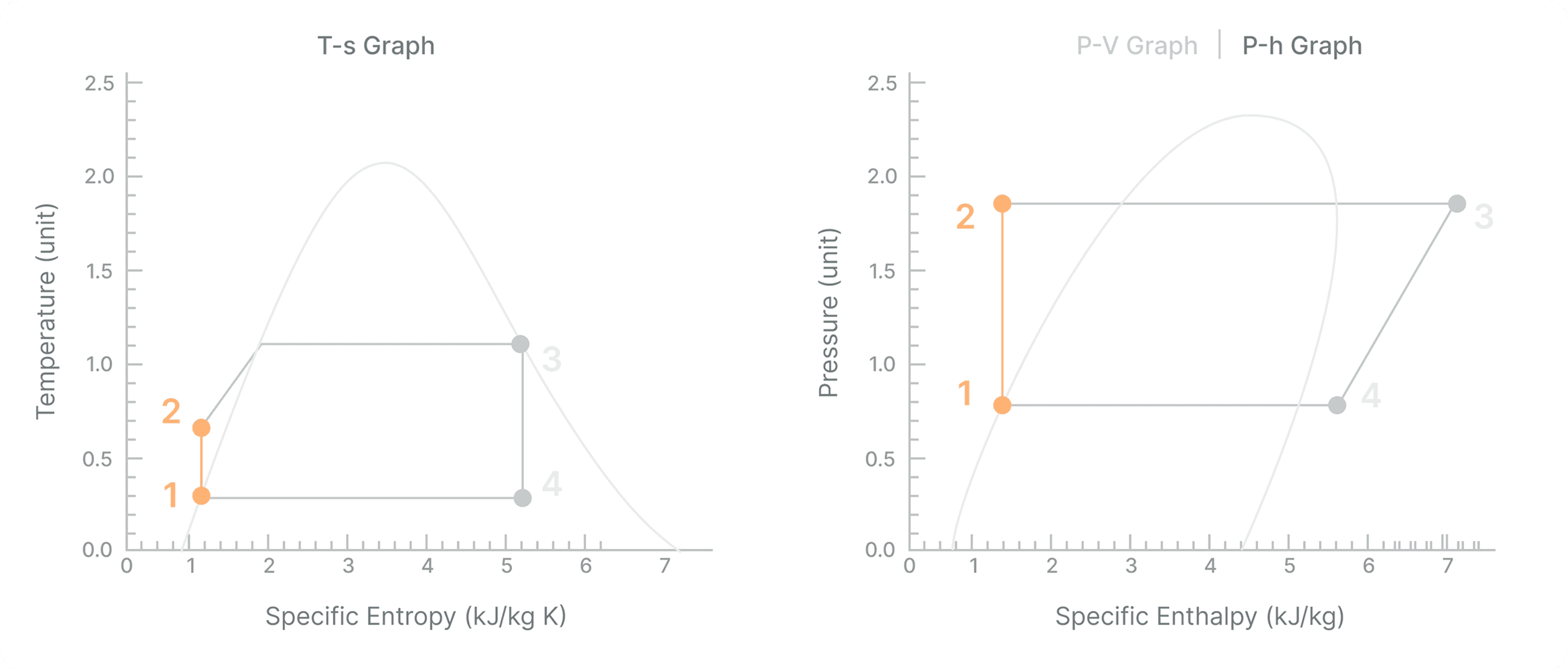
The values entered in the input fields also affect the shapes and sizes of the Pressure-Volume (P-V) and Temperature-Entropy (T-s) graphs shown on the bottom left of the screen. These diagrams gradually fill out as the visualization progresses through the different stages.
The Solution


This tool includes two of the most fundamental thermodynamics cycles: the Carnot cycle and the Rankine cycle. Users can switch between the two by clicking on the dropdown menu at the top center of the screen and selecting their desired cycle.
The Solution
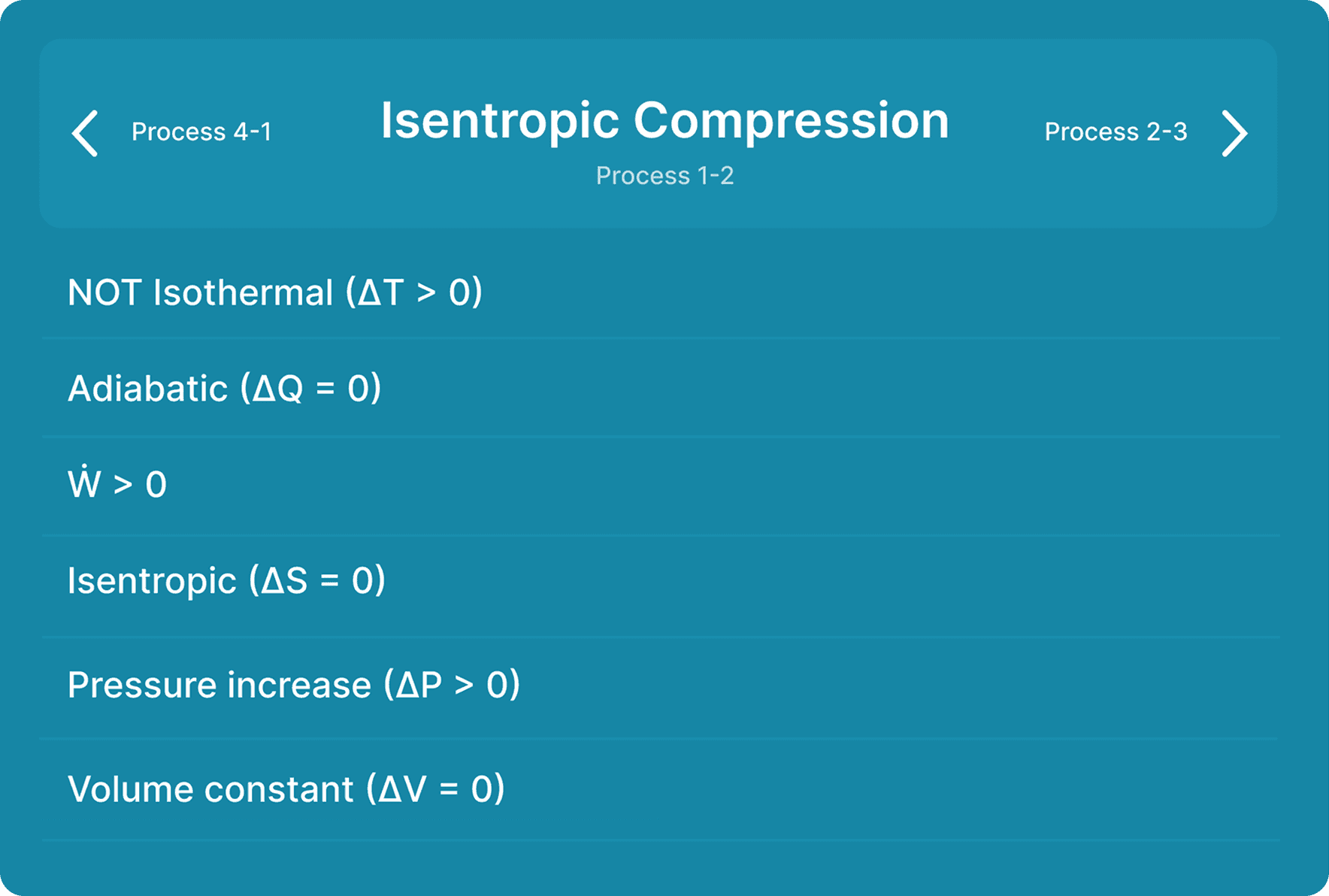

Under the visualization is an interface for controlling the stages of the cycle. This interface displays the name and number of the current stage as well as for the stages that are directly before and after in order to contextualize the current activity being shown. Users can click on the arrows to freely navigate between the stages. Below these controls is a description of each stage, broken up into easy-to-read bullet points, to provide more detailed context to the animation above.
The Process
We were fortunate enough to be able to closely follow the ideal design process for this project, which made getting user insights and feedback a streamlined process that helped us build a truly useful product for our users.
The Process

To get an idea of current solutions in the field of educational simulation software, we looked at a wide range of existing programs in the realms of visualization, simulation, and calculation – particularly in STEM fields. These included products such as Wolfram, Desmos, LearnChemE, PHET, Algodoo, and The Powder Toy. Although not all of these were related to thermodynamics, they all contained valuable insights about different methods of visualizing complex interactions. Our deep dives into these tools allowed us to both take inspiration from concepts that we liked as well as identify areas of improvement that we could build upon.
Inspiration:
The most successful of these examples break down complex physics concepts into easily understood chunks instead of trying to tackle everything at once
The visualizations and animations are oftentimes bright and simple, reducing cognitive load and making them easier to follow
Annotations embedded within the software, such as in tooltips or pop-ups, help contextualize the visuals being displayed
Opportunities for improvement:
The more detail a given application boasted, the more confusing and unintuitive the experience of using it -- balancing functionality and usability is a priority!
Aside from a certain few sandboxes, most applications have very limited interactivity – they focus on visuals and calculations, but do not allow users to directly play around with what they are looking at
Not many applications have guided instruction or detailed descriptions of the phenomena they are illustrating – they are quite clearly intended as non-standalone supplements to more formal external primary resources
The Process
We conducted extensive user interviews with our stakeholders, including current thermodynamics students, previous students, teaching assistants, and professors. We focused our questions around common strategies for studying thermodynamics and the most challenging aspects of the subject in order to better understand which areas we should be focusing on with our tool. We also asked about their experiences with existing simulation solutions (such as the ones we researched above) and inquired about which elements of each were most useful. After our interviews, we synthesized our findings by creating empathy maps, which helped in deriving hidden insights and uncovering interesting connections.
Here were our main findings:
Modeling and visualizations are a huge part of learning physics, but since thermodynamics is such an abstract area, there aren’t many useful resources for learning the subject hands-on
The extent of visual aids that students typically receive when learning thermodynamics is a basic chart with a curve, which isn’t helpful in the same way that an animation would be
It would be most useful to focus on the Carnot and Rankine cycles for this project, as those cycles are fundamental concepts in thermodynamics that would provide the most benefit to students when laid out visually
The Process
To begin the ideation phase of our design process, we worked on writing a strong HMW question. This question boiled down all of our insights thus far into a concise statement that would guide our thinking as we continued working on this project.
How might we create a tool that allows students to visualize complex thermodynamic processes in an intuitive way?
The Process
Once we had our HMW question, we decided to engage in a variety of team brainstorming exercises to come up with ideas. We participated in activities such as thinking caps, shout outs, and crazy-8s. This quantity-over-quality and “no bad ideas” approach allowed us to contribute any and all ideas that came to mind, resulting in many unique and effective directions to explore, including an interactive input field and graphs that correspond to the visualization. This brainstorming laid the groundwork for our sketches and eventual hi-fi mockups.
Here are a few ideas that came out of our brainstorming sessions. This was an incredibly valuable exercise in broadening our conceptions of what possible solutions could look like:
A video game in which players would be tasked with identifying and fixing issues with engines in cars and other vehicles to better understand potential applications of thermodynamics
Although this idea would address the need for concrete, practical applications of what students are learning, we didn’t choose this because the scope was too large and the thermodynamics educational potential was not enough -- designing a video game that is both fun and educational is tough!
A gallery of animated and annotated simulations for the most popular thermodynamics concepts
This idea addressed the need for visualizations, but we decided that it did not provide a solution for one of the biggest identified needs: robust interaction
A widget that combined educational descriptions, interactive animations, and an intuitive calculator in an integrated, cross-functional way.
This is the solution we ended up pursuing! We thought that out of all our ideas, this one was the most promising in addressing the needs we identified from our user research, as its multi-pronged approach would allow us to explore several modes and mediums of conveying information.
The Process
After our brainstorming session, we worked to transfer our ideas onto a visual medium by sketching out layout ideas on paper. This flexible format allowed us to experiment with different ways of displaying our desired features on the screen and gave us a rough idea of which layouts would work better than others.
For example, one set of sketches explored user-driven interactions to progress simulations of thermodynamic processes: using the mouse to turn a crank, stack stones on a piston, or push down a lever. Although this prompted us to think of more immersive methods of communicating with learners, we realized that these methods seemed to be emphasizing interaction for the sake of interaction itself rather than as a means for more intuitive understanding.


These next sketches focused on combining several modes of representation – conveying the same information in different ways. These sketches integrated an interactive visual animation illustrating the engine’s practical functionality, a plotted graph representing the cycle’s numerical outputs, and a real-time calculator mapping out the interrelations between the set of relevant values in the simulation.

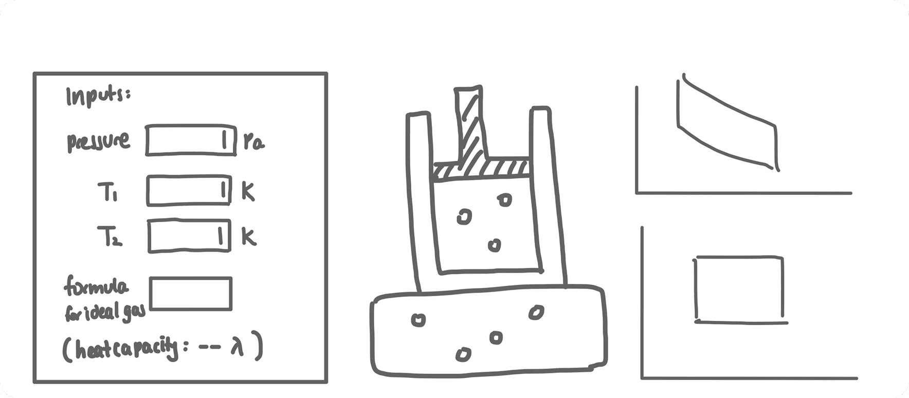

This was the direction we ultimately went in. Notably, we would not have arrived at the specific formation of the interaction animation without our earlier sketches – this is why it is essential to explore all possible ideas!
The Process
Once we had an idea of what general layouts to pursue from our sketches, we moved to Figma to start designing wireframes. This allowed us to have a better sense of how the elements from our sketches would look like laid out on an actual screen, as well as giving us the capability to prototype our designs and have users test them out.


As you can see, we started simple -- doing literal 1-1 recreations of sketches -- before expanding into more detailed wireframes.
The Process
We had a number of different grayscaled layouts and had to choose one to finalize into a high-fidelity mockup. We decided that the best way to do this would be through user testing with both major groups of our stakeholders: students and professors. We utilized A/B testing as well as more guided testing methods to understand which of our layouts was the most clear, intuitive, and easy to use. The conversations that we had with these users guided us to our most successful iterations, which we finalized and added color to in order to create the hi-fi wireframes.
Some of the most helpful feedback:
Having two animations for each cycle is unnecessary – only one of them is really relevant.
The most important thing on screen is the animation itself, with the calculations and graphs being important secondary elements.
Because there is so much information on screen, it would be very helpful to delineate relationships with a clear use of color and hierarchy.
We integrated all of this feedback to arrive at our final design above: a clear layout that focuses on the visualized animation and uses color to clearly indicate hierarchy.
Next Steps
From diving into thermodynamics with no prior exposure to integrating responsive and interactive animations, I’m proud of what we were able to accomplish in just 10 weeks. As is often the case with any good tool, though, there is always more that can be added. Given more time, there are several additional features that I would like to implement into this tool.
Broaden possibilities for the values and calculations possible in the calculator tool.
By nature, thermodynamics has a wide range of possible combinations of values to reach the same conclusions – we would like to capture that in our tool. We were able to get the most important and common ones, but if we want our tool to be truly all-encompassing then it is important to house all variations.
Add more cycles to expand educational potential.
Rankine and Carnot cycles are the most common, but I’d like to explore other concepts as well, such as the Otto or Diesel cycles.
Build out sections for history, limitations, and applications.
We intended these to be supplements to the primary visualization functionality, but scope did not allow for in-depth exploration.
Reflections
This project was unlike anything that I have worked on before, and I learned a lot from my experience with it.
Be familiar with what you are designing.
I knew nothing about thermodynamics going in, but making the effort to familiarize myself with the content through video tutorials and professor office hours enabled me to tailor this tool much more effectively to the students who would be using it.
The user will always catch things that you don’t.
Even with my quick and dirty background on the requisite physics, my knowledge was, of course, nothing compared to the students who actually studied the subject in earnest. Making sure to speak with them at all stages of design ensured that we did not miss critical pieces of functionality.
Focus on a niche and perfect it.